Custom Software Development Company
Custom software for work standard tools cannot handle.
Your team has patched the same workflow with spreadsheets, subscriptions, and manual checks. We turn the part worth owning into software that saves time, protects margin, and can be handed to another capable team.
Bring one stuck workflow. Leave with a build, buy, repair, or wait recommendation.
Trusted by






















The brief
Start with what is not working.
Good software decisions begin with the constraint, not a list of features or a preferred technology.
The workflow only works because one person remembers every exception.
Your team pays for several tools, then copies data between them by hand.
An MVP or AI-built prototype proved demand, but the product is hard to change or trust.
Plain answer
Custom software development means having an application built around your specific workflow, your people, your data, and the other systems it needs to talk to, for when off-the-shelf products no longer fit. A sensible first release completes one valuable path from start to finish. Scope, ownership, what 'done' looks like, and price are agreed before paid work begins.
What to remember
- Use this when the problem keeps repeating and costs more than owning the fix.
- The first release should complete one useful path, not collect disconnected features.
- The code, cloud accounts, data, and operating notes should stay usable by another capable team.
The first decision is not what to build.
It is whether software is the right answer at all. We use four possible recommendations before discussing a development scope.
- 01
Buy
Choose a maintained product when it handles the core workflow and the remaining gaps can be solved with configuration, a connector, or a small process change. Paying for software you do not have to maintain is often the better trade.
- 02
Repair
Keep the existing product when users still get value from it and the code can be understood safely. Start with evidence: where the code lives, how the data is organized, what is tested, which outside services it depends on, who can access what, and how updates go live.
- 03
Build
Own the system when the workflow shapes margin, customer experience, speed, or a product customers pay for. Start with one complete path and the system connections that path cannot work without.
- 04
Wait
Do not turn a changing policy into permanent software. Stabilise the rules, name the workflow owner, and measure the cost of the current process before paying for a product.
Not sure which path is yours? Bring it to a 30-minute call. Leave with the answer in writing.
Fit
Custom software should earn its maintenance burden.
A feature request is not enough. The case is real when the same constraint shows up in time, errors, margin, or customer experience.
A repeatable workflow crosses systems and creates measurable delay, error, or labour.
A proprietary customer experience, operating model, or data asset matters to the business.
The organisation can name a workflow owner and what 'done' looks like for the first release.
A maintained product fits with reasonable configuration and process change.
The team wants software to settle an unresolved operating policy.
The brief is a feature list with no user, transaction, or business result attached.
Not sure which side you are on? Use the first call to make that decision. A useful answer may be to buy, connect, repair, or wait.
Start with the operation, not the software.
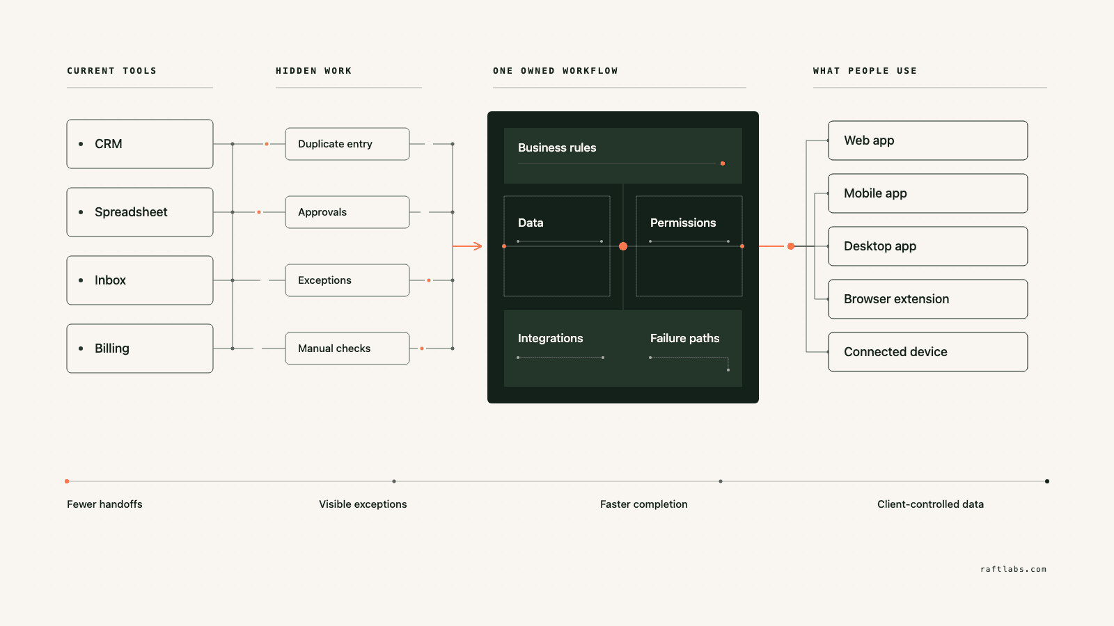
A custom software problem usually starts as an operating problem. Staff enter the same data twice. Customers wait for someone to move work forward. One person remembers every exception. The key question is whether that friction repeats, can be measured, and costs enough to justify owning the fix.
Take an operations team that uses a CRM, spreadsheet, email, and billing system for one customer request. The visible complaint may be "we need a dashboard." The real cost may sit elsewhere. No one can see what is blocked. Staff apply rules in different ways. Customers only get an update after they ask.
A second product hides inside the first. Customers see one screen; your team lives in another: approvals, exceptions, refunds, managing users, and a record of who did what. Quotes that squeeze all of that into an "admin panel" line item are where budgets most often break. On a real platform, your team's screens are routinely the most underestimated part of the build, so we quote them as their own job, with their own users, from the start.
Custom software development makes sense when one owned system can remove that constraint better than a product, connector, or process change. The first release should take the smallest useful path from trigger to result. It should not replace every tool at once.
Swipe horizontally to follow the workflow.
We start where it hurts.
The interface is only one part of the job. The real scope includes the rules, the data, the connections to your other systems, what happens when things fail, who can see and change what, and who runs it after release.
Manual operations that no longer scale
Replace repeated data entry, approvals, reconciliation, scheduling, or exception tracking when the work is stable enough to encode and expensive enough to justify owning.
Customer portals and self-service workflows
Give customers one clear place to submit information, see status, make decisions, and complete work that currently depends on email, calls, or staff intervention.
A product that needs a safe takeover
Audit an inherited codebase, keep what is sound, and create a controlled path through the backlog. The first goal is not a rewrite. It is being able to change the product without guessing what will break. After recovery, ongoing maintenance keeps it that way.
A software-enabled service or new product
Turn domain knowledge into a product customers can use or pay for. Scope the transaction, roles, commercial model, support controls, and operating work together.
An AI-built prototype that proved the idea
Keep the learning and the useful interface. Fix the fragile data handling, access controls, system connections, and how the AI's work gets checked, before real customers or regulated information depend on it.
Which one is yours?
Bring it to a 30-minute call. Leave with a build, buy, repair, or wait recommendation in writing. Free, whether or not we ever work together.
Verticals
Custom software for specialised operations.
Some workflows only exist in one industry. The same rules apply: configure first, build only the part the maintained products cannot cover, and start with one complete path.
Construction operations
One job record from estimate to actual cost. Shared job and cost-code structure, field and document workflow with fast contextual capture, site photos pinned to drawings, daily reports, timesheets, and toolbox talk records, explicit offline state with sync and conflict handling, and office review that closes the loop. Commercial approvals tie to evidence; accounting integration is owned by your controller. Configure Procore or Autodesk when they fit; build only the workflow they cannot cover. Estimating follows the same rule: construction takeoff software keeps every quantity tied to its plan sheet, revision, scale, and reviewer, treats AI detections as suggestions until estimator review, and exports clean totals into the estimate.
Business brokerage
A confidential listing-to-close workflow: seller and listing records with authority, a private buyer CRM, NDA-gated document release and controlled access, enquiries, offers, diligence, and commissions, with audit on every access. Automatic buyer-to-listing matching narrows the list against broker-approved criteria; it never certifies fit, funding, or intent. The controls most deal rooms lack are identity, signer authority, seller approval, document version, and a traceable exception path.
Car wash memberships
Car wash membership software starts at the transaction, not the dashboard. One authoritative membership and entitlement model across sites, lane equipment connected through verified vendor interfaces, payment reconciliation with an exception queue, and staff tools that resolve plate ambiguity, offline validation, and disputed visits with reason and audit. Build custom only when several sites or vendors create an entitlement problem a maintained platform cannot reconcile.
Interior design studios
Interior design software development earns its place at the handoff. Specification and selection records versioned against client approvals, purchasing, receiving, and installation tracked to closeout, and markup and margin calculated from approved rules with trade costs and vendor discounts visible only to staff roles. Houzz Pro and Studio Designer cover standard studios; custom fits when procurement is the competitive advantage.
Martial arts schools
Martial arts software for one enrolment-to-rank record: households and students with permissions, programmes, schedules, and attendance, versioned curriculum with evidence, testing events, and belt and rank history that corrects without erasing. Software never decides when a student is ready to grade; qualified instructors do. Custom fits only when a grading or franchise workflow will not fit a maintained product.
Proof
The fifth attempt became a product customers could keep using.
UrShipper had already worked with four development vendors. Its founder describes the communication and decisions during the recovery.
The case study documents a 14-week recovery, five carrier connections, a Shopify fulfilment workflow, and client-reported results. It is one comparable project, not a promise that every inherited codebase can follow the same plan.
Read the UrShipper case studyWhich workflow is costing you the most right now?
Bring it to a 30-minute call. Leave with a build, buy, repair, or wait recommendation in writing. Free, whether or not we ever work together.
Let the work pick the shape.
The way people work should decide the form of custom software. Start with where the user works, which device they have, whether the signal drops, what data they need, and how fast the system must respond. Those facts tell us what belongs in the first release.
Web app
Work done across roles and locations. Each user gets the same current information in a browser: no installs, no versions, no device limits. When in doubt, this is usually the right first surface.
Mobile app
Work away from a desk: camera, location, alerts, offline access.
Desktop app
Local hardware, large files, work without a browser.
Browser extension
One task inside a system that otherwise works.
Connected devices
IoT and wearables, when the physical setting demands them.
One product may need several surfaces. Each one should support the same complete workflow, not start another feature list.
How it works
Close one expensive risk before opening the next.
Each stage answers a buyer question and leaves behind a decision you can inspect. The next stage only opens when the expensive uncertainty in the current one is small enough to accept.
- 01Understand
Trace the real workflow
Where is the cost or failure actually coming from?
Follow one user and one transaction from start to finish. Include the workarounds, manual judgement, duplicate entry, waiting, and failure paths that a tidy process diagram usually misses.
Decision produced
A map of the workflow, exceptions, owners, systems, and the baseline cost or delay worth changing.Risk closed
Paying to automate the visible symptom while the expensive constraint remains. - 02Shape
Choose the first useful release
What needs to exist together for one useful result to work?
Choose the shape from the way the work happens, not from a preferred technology. Name the user, the device, the data, the system connections, who can access what, the exceptions, and the result the first release must complete.
Decision produced
The right mix of web, mobile, desktop, browser extension, connected device, wearable, or behind-the-scenes connection work, with the first-release boundary and a clear definition of done.Risk closed
A small-looking feature list that quietly depends on several interfaces, systems, and owners. - 03Prove
Review working software
Will it hold up outside a controlled demo?
Review the product against the agreed workflow, not a tour of finished screens. Record changed assumptions and test what happens when data is missing, access is wrong, or a connected system fails.
Decision produced
Working checkpoints tested with realistic data, real user types, system connections, recovery plans, and the people who will use or run the system.Risk closed
Discovering the important gaps during migration or after customers depend on the release. - 04Transfer
Release, measure, and hand over
Did the new workflow improve the original constraint, and can another capable team operate it?
Move a controlled set of users or records first. Compare time, errors, completion, or another agreed measure with the starting point before adding the next workflow.
Decision produced
A controlled release, comparison with the baseline, operating notes, account ownership map, and a recommendation for what should happen next.Risk closed
Measuring development activity instead of the business result, or depending on the original vendor to keep the system running.
What stays out of the black box
These are operating conditions to put in the engagement, not claims to take on faith.
The scope names one complete workflow
The user, the trigger, the decisions, the data, the exceptions, and what 'done' looks like. A screen list is not enough.
Progress is visible in working software
Reviews against the product at agreed checkpoints, while there is still time to act.
A scope change has a price before it has code
A new workflow or system connection shows its effect on cost and timing before anyone approves it.
Ownership exists throughout, not only at handover
Code, cloud, data, and provider access stay visible and under your control from day one.
The work is checkable without being technical
Checkpoints are working software you use yourself, reported in plain language.
Custom software by industry.
Start from your domain. Each area below is a working practice with shipped products behind it.
What it costs
Every project starts at $10000.
The first phase turns the costliest patched workflow into a scoped build with written acceptance criteria.
Starting investment
Starts at $10000
Workflow complexity, systems to connect, data migration, and user roles set the scope. After a 30-minute call, you get a written build, buy, repair, or wait recommendation plus first-phase direction. Free, whether or not you build with us.
Not ready to talk? Start here.
Four useful next paths: decide whether to own the software, estimate the cost range, understand what moves the price, or inspect a comparable recovery.
Run the build-vs-buy calculator
Compare the cost and operating trade-offs before turning a workflow into a development brief.
Estimate the cost range
Get a working cost range for your scope before you talk to any vendor.
Read the cost guide
See the scope factors that move price, timing, team shape, and long-term maintenance.
Inspect a product recovery
See what changed when UrShipper moved from four failed vendor attempts to a controlled migration.
Work with us
Bring one stuck workflow. Leave with a decision.
In a 30-minute call, we will help you decide whether to buy, connect, repair, build, or wait. If custom software is not the sensible next move, that is still a useful answer.
- One named workflow owner and one complete path for the first phase.
- Scope, price, what 'done' looks like, and exclusions agreed before paid work starts.
- Code, cloud, data, and provider access remain under your control.
- Post-launch warranty cover for defects in the agreed scope.
Common questions
Custom software development creates an application around one organisation's workflow, users, data, and systems. It can be a web app, mobile app, SaaS product, internal tool, platform, or integration. It makes sense when configuration and process changes cannot remove a measurable business constraint.
Buy an existing product when it handles your workflow with reasonable setup and its pricing makes sense. Build custom when the way you work is itself the advantage, when repeated manual work has a measurable cost, or when a critical connection to your other systems cannot be done cleanly any other way. If the rules of the operation are still changing every week, wait and settle them first.
For a small, well-defined task with someone technical managing it, freelancers are often cheaper. The pattern that goes wrong is a non-technical buyer coordinating several freelancers becoming the project manager, the tester, and the person who discovers the pieces don't fit. A custom software development company earns its fee when the work needs coordination across screens, rules, data, and connections: one accountable party, one phase price, and checkpoints against the whole workflow. If your need is one screen or one fix, hire the freelancer.
The first paid phase may cover a bounded audit, a proof of concept, a recovery plan, or a small first release. The final price depends on how deep the workflow goes, how many kinds of users it serves, what it needs to connect to, whether data needs moving over, whether phones or tablets are involved, any compliance requirements, and the condition of existing code. The agreed phase is priced in writing before it starts.
Timing depends on scope: a bounded audit or proof of concept is a smaller engagement, while a platform with several system connections, data to move over, mobile apps, or formal compliance controls takes longer. The schedule is set once the first workflow and what 'done' looks like are clear.
Yes. Takeover is a common first engagement, and it always starts with an audit: where the code lives, how your data is organized, what is tested, which outside services it depends on, who can access what, and how updates go live. Code that is understandable and fit for the next release stays; only the parts blocking reliability get replaced. AI-built prototypes from Lovable, Replit, Bolt, or v0 can be assessed as starting points. And if you already paid another vendor and have nothing working, the audit tells you which story you have before you spend more: the most expensive version is the product that looks finished, clean screens and clicking buttons, while underneath nothing is tested and the security checks run in the browser, where anyone can tamper with them, instead of on the server where they hold.
Security starts with the data, the people, who can see and change what, the systems it connects to, and where it runs. The scope can include access controls, separate testing and live environments, protected passwords and keys, activity logs, backups, recovery plans, and whatever your regulation requires. We write down which protections are included and which evidence your team or an independent specialist must provide. We do not call a product compliant until the technical, operational, and legal requirements are all verified.
We need one person who owns the workflow, access to the relevant users and systems, timely answers on business rules, and someone who can accept or reject each milestone. A weekly working session is usually enough once the scope is stable. Your team should not have to manage developers day to day. The team that scopes your project is the team that does the work: no handoff to another vendor after you sign, and you can talk to the people doing the work directly.
Ask for the quote to name everyone who will use the system, including your own team. Every platform has two products: what customers see, and what your people use all day: approvals, exceptions, refunds, managing users, and a record of who did what. When that second product is quoted as an 'admin panel' on a single line, it becomes the overrun. Our quotes treat your team's screens as their own scope, with their own users. Then the phase names the workflow, what 'done' looks like, the price, and the exclusions, all before paid work starts. You review working software at agreed checkpoints, and when new information changes the scope, you hear the effect on price and timing before anything is approved.
You judge what you can see, not the code. Every checkpoint is working software you click through yourself, tested against the workflow agreed at the start. Progress is reported in plain language: what changed, what's next, and what it costs. Because you own the code, the accounts, and the operating notes throughout, nothing about the work is locked inside our heads. Our job is to make the work checkable; your job is to check it against your business.
You own the code built for you and control where it lives, the cloud accounts, the data, analytics, and third-party subscriptions. Outside services and open-source pieces keep their own licence terms. The operating notes and handover material stay current so another capable team can take over.
Every launch includes post-launch warranty cover for defects in the agreed scope, release support, and small screen corrections. After that, work can continue as another fixed phase or an ongoing product engagement. The code and accounts stay under your control either way.
Configure an established platform when its project, document, field, cost, and permission model fits. Build an extension when one integration or workflow is missing. Own custom software only when the differentiating process, client product, system network, or cost of constraint justifies build and support. Compare migration, adoption, roadmap, and total operating cost.
Yes, for explicitly designed workflows. The app stores a limited local dataset, queues edits and media, shows sync state, retries safely, and resolves conflicts under approved rules. Offline support adds complexity around identity, device storage, document versions, timestamps, and large files. Test with real site conditions, not only an office network.
Yes, when the accounting product offers suitable access and your controller owns the mapping. Define which system owns jobs, vendors, cost codes, commitments, time, invoices, payments, and actuals. Test duplicates, closed periods, retries, rejected postings, and reconciliation. RaftLabs builds the connection; your finance team approves accounting treatment and controls.
The most expensive decision is choosing a solution the field team will not use. It should start solving problems, not creating them, the second it reaches field hands. Custom software will not fix undefined commercial policy, inconsistent cost codes, unowned documents, or field work that nobody is responsible for recording.
The app stores the approved working dataset and queued changes on the device, then syncs when connectivity returns. Users need to see what is current, pending, failed, or conflicted. Rules decide which record wins and which needs review. Sensitive local data, media size, authentication expiry, and device loss also need controls.
Yes, if the project and document model is defined. A photo can carry job, level, area, item, timestamp, author, drawing version, coordinates where appropriate, notes, and assignment. Do not treat GPS as precise indoor proof. Drawing revisions need stable references so evidence does not silently move when a new plan is issued.
Test it with the superintendent who will use it: document one real shift, manpower, work, equipment, materials, weather, delays, photos, sign-off, then ask an office user to find one event six months later. A timesheet that records hours without what work they went toward is a payroll tool, not a job-cost tool: cost-code attribution at clock-in turns entries into job-cost data.
Contractors already on Procore or Autodesk should first check what reporting their existing ecosystem offers. Custom earns its place when the site workflow is genuinely proprietary: permits and isolations, subcontractor onboarding and training proof, toolbox talks that must get done. A mobile form fails if it takes longer than paper, hides sync status, depends on perfect connectivity, or creates office data nobody reviews.
It loads controlled plan sets, applies verified scale, lets estimators count or measure geometry, organises quantities by location and trade item, records assumptions, and sends reviewed results into an estimate. Takeoff supports estimating; it does not approve the bid.
Models can suggest symbols, regions, labels, or measurements, but output quality varies with scan quality, drawing convention, discipline, scale, and revisions. Keep source evidence, confidence, and a fast estimator review. Never convert an uncertain detection directly into an approved quantity or bid.
Every measurement must remain tied to its source sheet, revision, scale, area, author, and review state. When a new set arrives, the tool should identify changed sheets, preserve prior evidence, and help estimators decide what to carry, replace, or remeasure. Automatic revision transfer without visible provenance can create expensive silent errors.
Match the tool to the workflow: fast PDF measurement, cross-office PDF review, or cloud access with bidding integration. Trial options on your own plan sets. Takeoff software cannot rescue uncontrolled plan revisions, unknown scale, inconsistent item libraries, or a bid process nobody will review.
A focused release may include seller and listing records, a private buyer CRM, criteria and segmentation, teaser distribution, confidentiality agreement state, controlled document access, enquiries, meetings, offers, diligence tasks, commissions, closing handoff, role access, and audit. Brokers and advisers define the transaction and disclosure policy.
Software can filter or rank buyers against broker-approved criteria and explain the fields used. It should not represent fit, funding, eligibility, intent, or suitability as fact without human review. The broker owns outreach and recommendations; the buyer and advisers own diligence and investment decisions.
No. A workflow can verify an approved agreement state before access, but the brokerage and counsel decide whether the agreement is valid, the signer has authority, the recipient is correct, the version is releasable, and exceptions are permitted. Access, download, revocation, and exports still need controls and monitoring.
Broker commissions vary by deal size and structure, and retainers are sometimes credited against success fees. Get the fee structure in writing before you sign, and ask exactly how the broker protects confidentiality. Software does not change the economics of the deal; it keeps the right documents in front of the right buyers.
Evaluate closed deals in your size and industry. Get the fee structure in writing. Ask exactly how they protect confidentiality. Make them explain their process mechanics. Software cannot substitute for the broker's network and judgement, but it can stop the wrong buyer receiving the file.
Only when the controller, pay station, reader, POS, or vendor exposes a documented and permitted interface. We confirm protocols, credentials, commands, safety states, warranty and vendor constraints, test equipment, and failure behaviour before committing to integration. An unavailable or restricted interface can change the product boundary.
Define one authoritative member, vehicle, plan, entitlement, billing status, site override, pause, cancellation, and renewal model. Each validation keeps the plan and source version used. Offline sites follow a capped policy, while duplicates, transfers, chargebacks, and disputed visits enter a staff review path.
Treat vendor accuracy claims as claims. Plate ambiguity should resolve through authorised staff review with reason, evidence, and audit. Validation must keep working when the connection drops, and one vendor change must not corrupt the core model.
Fleet accounts: one company, a plate list, a single invoice, distinct from retail memberships. A membership must entitle the vehicle at every site, with an authoritative source for member, household, vehicle, plate, plan, site access, billing status, pause, renewal, cancellation, transfer, visit limit, upgrade, promotion, and override.
Failed-payment recovery matters most: retry the card, notify the member, and recover the subscription before it lapses. Add a rebooking nudge for lapsed members, one message plus a small incentive.
A bounded flow may cover projects, spaces, items, variants, dimensions, images, vendor and client descriptions, cost, quoted price, tax, freight, lead time, alternates, approvals, quotes, purchase orders, acknowledgements, deposits, invoices, receiving, damage, returns, installation, and closeout. The record owners and accounting handoffs are defined before interface design.
It can calculate client-approved formulas from versioned inputs and show cost, markup, discount, tax, freight, fees, invoicing, payment, and projected or realised margin according to the chosen accounting treatment. Finance and tax advisers must approve the rules. Vendor credits, returns, substitutions, shared freight, currency, accrual timing, and partial fulfilment need explicit handling and reconciliation.
Pricing visibility is role-based from the ground up. Clients see retail or agreed project pricing; trade costs, vendor discounts, and your markup stay visible only to staff roles. Approval workflows can hide line-item costs entirely and show clients only package totals. Every price a client sees is generated from the same rules your team uses internally, so there is never a mismatch between the portal and the invoice.
Houzz Pro and Studio Designer are the right call for solo designers and small studios running standard projects. Hire a development company when the studio's scale or model breaks the template: multiple offices sharing one procurement pipeline, proprietary vendor catalogues with negotiated trade pricing, complex markup and margin rules per client tier, client approval workflows that must tie into your accounting, or a trade programme with its own ordering logic.
Photo-in, layout-changed-out remains unsolved for real design work. The demo test: make vendors run degraded, scanned floor plans in the demo, not curated renders. Probe how long it takes to finalize a design, quote accuracy, measurement accuracy, and handling design changes from client feedback.
A focused release may include households, students, guardians, programmes, classes, enrolment, attendance, approved curriculum, prerequisites, instructor observations, test eligibility, test events, rank history, memberships, payments, communication, role access, and location reporting. The school defines instruction, assessment, promotion, safeguarding, billing, and records policy.
No. Software can show approved prerequisites, attendance, instructor observations, prior tests, missing evidence, and an authorised approval workflow. Qualified instructors own readiness, assessment, accommodations, safety, grading, promotion, and corrections. A calculated status should never replace instructor judgement.
Preserve programme, curriculum version, rank, prerequisites, evidence, instructor, test event, result, approval, effective date, certificate or reference, deferral, correction, transfer source, and prior history. Do not overwrite a past rank when curriculum or terminology changes. Make imported and verified records distinguishable.